Make Signage Clear and Concise
Firstly, make sure that the signage is stating its purpose clearly. In an environment as professional as a conference event, it is vital that you portray your brand in a clear way.
With your brand colors, fonts, clear messaging and perfect type of signage, your event is sure to feel on point before the event even begins! It will give clarity about the event, avoid miscommunication and make the event smoother.
Use High-Quality Materials
When you use high quality materials for your event signage, it shows, and makes a difference.
Good quality sets you apart from others, making a positive impression on your clients and making your brand memorable. High quality materials also last longer, saving you money on getting new signs for every event you have.
If your event is outdoors, make sure you are taking the weather into consideration and have waterproof signs. You can even opt for advertising umbrellas!
Incorporate Event Branding Elements
Event branding elements tie you with your brand. Whether it is a design element, a color or your usual font, making sure every piece of signage has those elements is important.
That way, you create a consistent and recognizable environment at your conference. With consistency, comes cohesiveness and visibility that will help with sponsorships as well as reinforce key messages easily.
Place Signage Strategically Throughout the Venue
When you strategically plan the placement of your signage throughout the venue, you directly maximize the effectiveness of your event/conference.
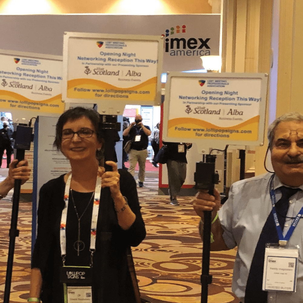
Start with the directions, and make sure you are placing the signs that direct your clients or employees towards the right way, so that there is no confusion or delay in your programs and schedules because of missing people! Cover all the entrances, registration areas, restrooms, food and beverages area, etc.
See how the general flow of your venue is, and make sure your signs are properly visible and accessible. Keep a hierarchy when it comes to your signs, make sure the most important ones, the ones which show partnerships, directions and logos are most prominent.
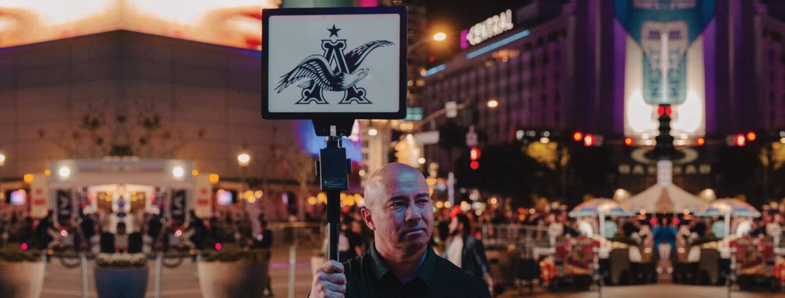
Try different shapes, sizes and types of signs for this. You can even try our LED Illuminated Signs to stand out even more!
For more information on LED Illuminated Signs, click here.
Consider Interactive or Digital Signage
If you want to enhance engagement with your clients, employees and fellow conference members, consider interactive or digital signage to make the event even more dynamic!
Make sure that the digital or interactive signage’s technology is user friendly so as to not create misconceptions or confusion. Provide support or instructions to those who are new to the technology.

Where can we Use Conference Event Signage?
✓ Entrance and registration
✓ Different rooms for sessions
✓ Restrooms
✓ Outdoor signage
✓ Sponsor recognition
✓ Information desks
✓ Digital displays in high-traffic areas
Want to know more about the type of signage you can have for your upcoming conferences? Check out more about Lollipop Signs here!


Leave a Reply